

Brand identity design gives your business a recognisable visual language. It includes your logo, colours, typography, imagery and the way these elements work together. A logo alone cannot provide consistency if every poster, quotation and website page follows different rules.
For a growing business, the goal is practical: help customers recognise you and help your team produce consistent materials. This guide develops the branding section of our web design and branding guide.
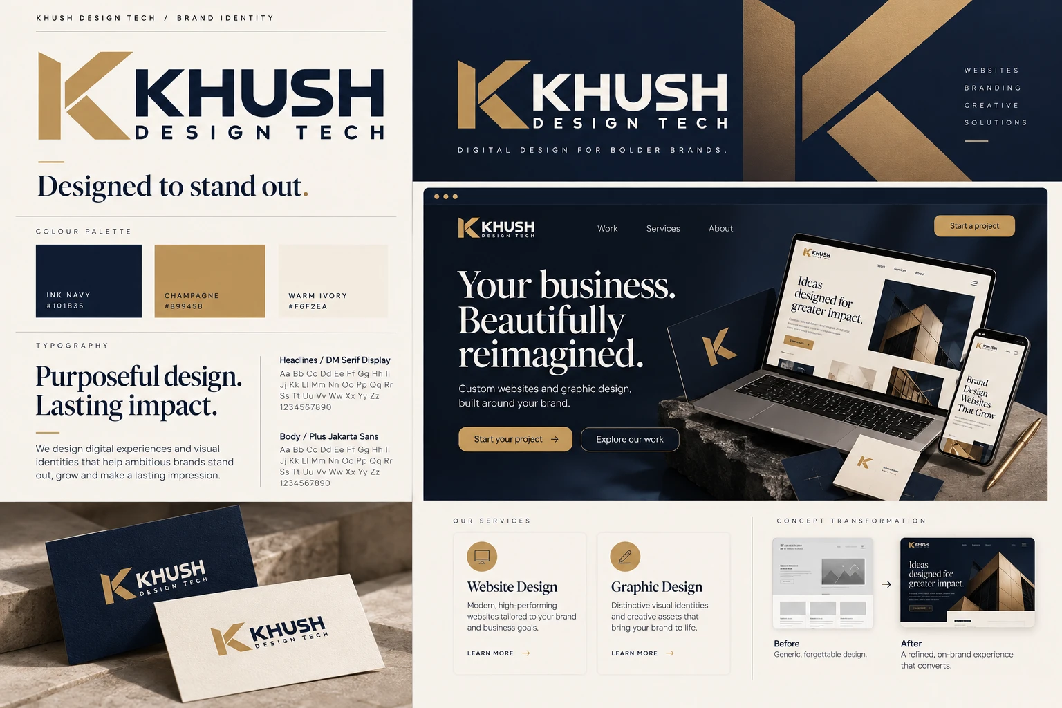
Define what the brand should communicate
Start with your audience, offer and personality. Write three qualities you want customers to associate with the business, then explain what each means in practice. “Reliable” might suggest clear information and organised layouts; “creative” still needs to feel appropriate for the people buying your services.
Collect examples to discuss direction, but explain which features you find useful. A reference can inform spacing or tone without copying another company’s identity. Your own positioning should guide the result.
Build a logo system, not one image
A logo needs to work in different spaces: a website header, social profile, invoice and printed sign. Ask for suitable horizontal, compact and single-colour versions where the design supports them. Test small sizes so fine details do not disappear.
Keep a clear master file and approved exports. Avoid stretching the logo or repeatedly saving a low-resolution screenshot. Establish minimum sizes and breathing room appropriate to the mark. These simple rules prevent many everyday inconsistencies.
Choose colours and typography for use
Define primary colours, supporting colours and neutral backgrounds. Explain their roles: which colour highlights an action, which is used for body text and which provides a quiet surface. A palette becomes useful when people know how to apply it.
Select typefaces that are readable and suitable for the required languages and formats. Check font licences for the intended uses. On websites, test text against its actual background rather than judging colours in isolated swatches.
Make templates for recurring work
Identify the materials your business creates repeatedly. These may include social posts, quotations, business cards, delivery notes and presentation covers. Templates should preserve the identity while leaving enough flexibility for different amounts of content.
For example, a logistics business can use a consistent heading style and information order across quotations and delivery notes. The document still needs to prioritise accurate operational details. Branding should make the information easier to use, not compete with it.
Connect the identity to the website
Your website should feel related to your printed and social materials, but it has different requirements. Buttons need clear states, content must remain readable and layouts must adapt to phones. Brand consistency does not mean recreating a printed poster as a webpage.
Our mobile design checklist explains these usability considerations. For informative images, use the W3C alt-text guidance to communicate meaning beyond the image itself.
Create a useful handover folder
Organise approved logos, colour values, font information, templates and a short usage guide. Label files by purpose so a printer and a social media editor can find the right version. Keep editable source files where your agreed scope includes them.
Clarify ownership and licensing in the project agreement. Confirm whether photographs, icons and fonts have separate restrictions. A complete handover should make future work easier, even when another supplier prepares the next item.
Review consistency through real examples
Place a website screenshot, poster and business document side by side. Check whether the logo treatment, colours, type and tone feel connected. Then test each item on its own: recognition is useful only if the material also communicates clearly.
Explore our graphic design services and portfolio. Continue with the marketing graphics guide, or ask us to help organise your business identity.