


Studio identity / Agency brand identity
Khush Design Tech
Designed to stand out.
The brief
A more considered
first impression.
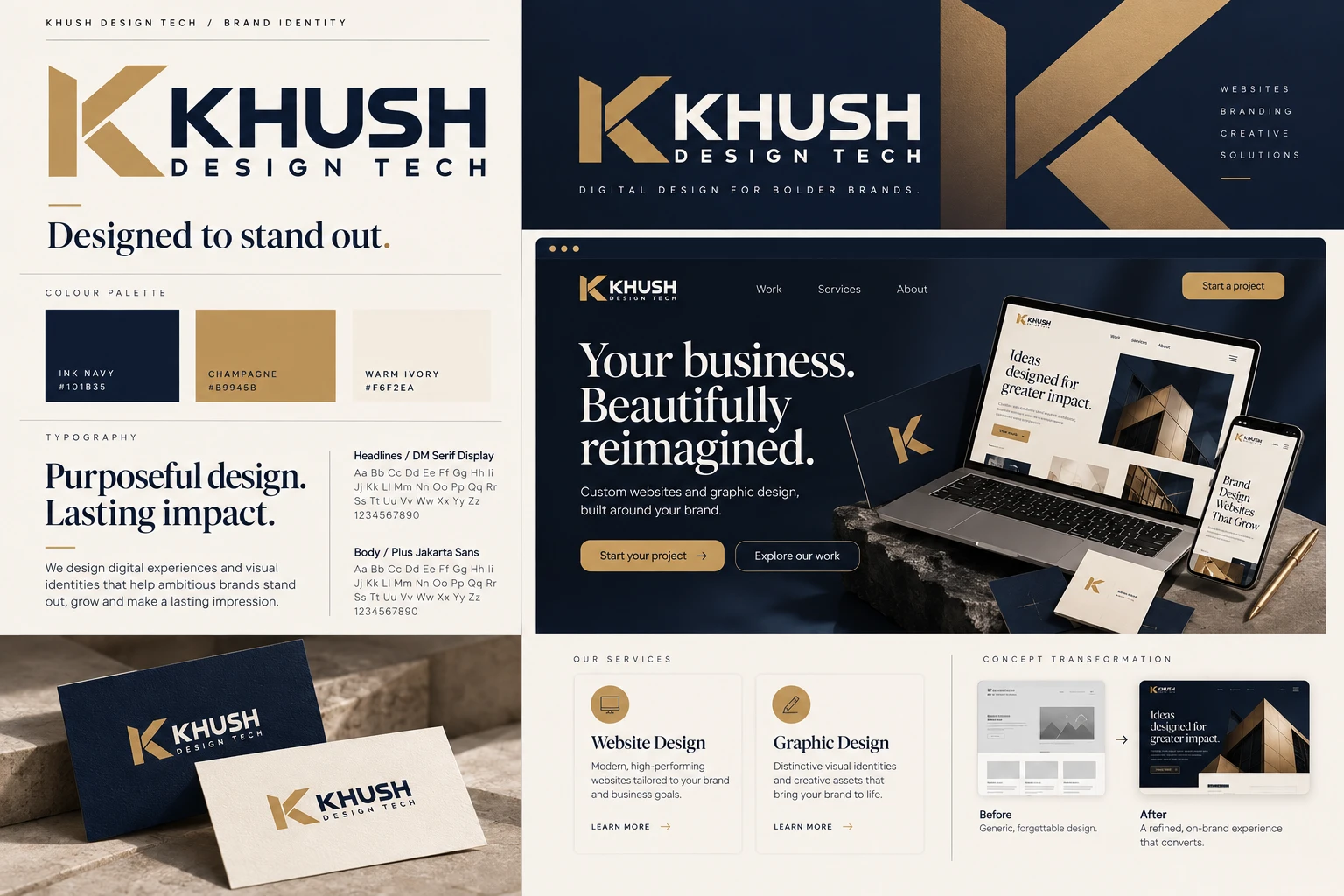
This project explores the Khush studio’s supplied visual identity and its applications.
The challenge
Create a recognisable identity that connects website design and visual communication under one distinctive brand.
The design direction
An angular K, ink navy and champagne gold create a coherent identity. Editorial serif headings balance the precision of the geometric mark.
Services demonstrated
Visual identity, creative direction and coordinated brand applications.
A closer look
A visual language that belongs together.
Design decisions
Details that make
the difference.
- A distinctive angular brand mark
- A shared palette across digital and print
- A clear typographic hierarchy
Visual foundation
#B9945B · #101B35 · #F6F2EA
DM Serif Display + Plus Jakarta Sans
The visual system uses contrast, spacing and repeated brand details to connect different applications.
Keep exploring
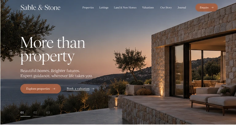
Another point of view.

Inspired by what you see?